Alpha Style Button Subthemes
Description
The Alpha Style includes many pre-built subthemes for Buttons.
Discussion
The available subthemes for a Button in the Alpha style include:
- base
- confirm
- deny
- left
- right
- primary
- secondary
- raised
- subtle
- icon
- iconText
- iconRaised
- capsule
- capsuleRaised
- capsuleSubtle
- capsuleSubtleRaised
- circle
- circleRaised
- circleSubtle
- circleSubtleRaised
Additional information about each subtheme can be found below.
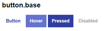
base
The "base" subtheme is the default subtheme used if no other subtheme is defined. base is also required. Every "Part" in a Version 4 theme has at least one subtheme: base. The button's base subtheme is shown below:
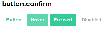
confirm
The confirm button subtheme uses the "Confirm" and "ConfirmForeground" colors in the Alpha style rather than the Accent color. The Alpha style uses a shade of green for the Confirm color.
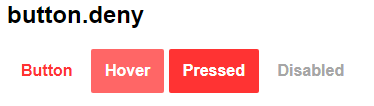
deny
The deny button subtheme uses the "Deny" and "DenyForeground" colors in the Alpha style rather than the Accent color. The Alpha style uses a shade of red for the Deny color.
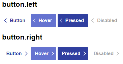
left, right
The left and right subthemes integrate an arrow into the button. This is done using CSS rather than changing the button layout in the UX. By using CSS to style the arrow, every button across the entire app can be changed quickly to use a different image without needing to manually update every button in the project.
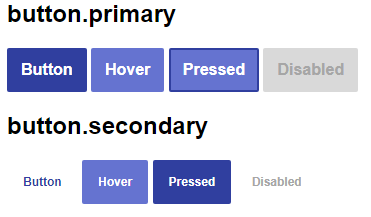
primary, secondary
The primary and secondary subthemes offer an alternative to the base. The primary subtheme uses a background color for a button in its normal state. When pressed, a border is applied to the hover state.
The secondary theme uses a smaller font size than the base theme.
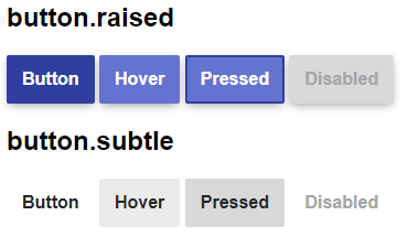
raised, subtle
Buttons using the raised subtheme extends the primary look with a shadow. This gives the impression of depth.
The subtle subtheme uses grey shades. Subtle coloring is often seen with buttons such as "reset" buttons where the action needs to be available but is not the primary action on the form (i.e. "submit".)
icon, iconText, iconRaised
In mobile layouts, icons are often used in place of text or conjunction with short text phrases (send, edit.) The purpose of the icon themes is to provide a subtheme used with buttons using an "Image only", "Text above Image", or "Image above Text" layout.
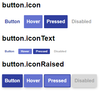
In the image below, the two buttons in the middle use the "Image above text" and "Text above image" layouts respectively. When they are configured to use the iconText subtheme, the text fits nicely with the icon, giving it the same height as a base button.

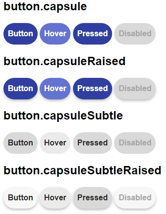
capsule, capsuleRaised, capsuleSubtle, capsuleSubtleRaised
The capsule buttons are an alternative set of buttons to the rectangular shapes of the base, raised, and subtle subthemes. Their primary feature is the border radius applied to the button, giving it the appearance of a capsule.
circle, circleRaised, circleSubtle, circleSubtleRaised
Just like the icon subtheme, the circle subtheme is best used with images or short text strings. The circle sub-themes are best used with icons or buttons that contain one or two characters (letters or numbers.)
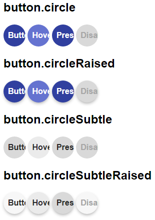
The image below shows four circle subthemes applied to a button set to "Image Only".